01 - CHALLENGE
Creating cohesion without repetition
The journal needed to cover a wide range of subjects, from architecture and fashion to independent makers and changing urban culture. A rigid visual language would flatten those stories, but complete creative freedom would make the publication difficult to recognise from one issue to the next.
The challenge was to create a framework that could hold contrast. Each story needed room to find its own atmosphere, visual tempo, and point of view, while still contributing to a larger editorial identity. The direction also had to work across print, web, social content, and moving image.
02 - APPROACH
A system of atmosphere
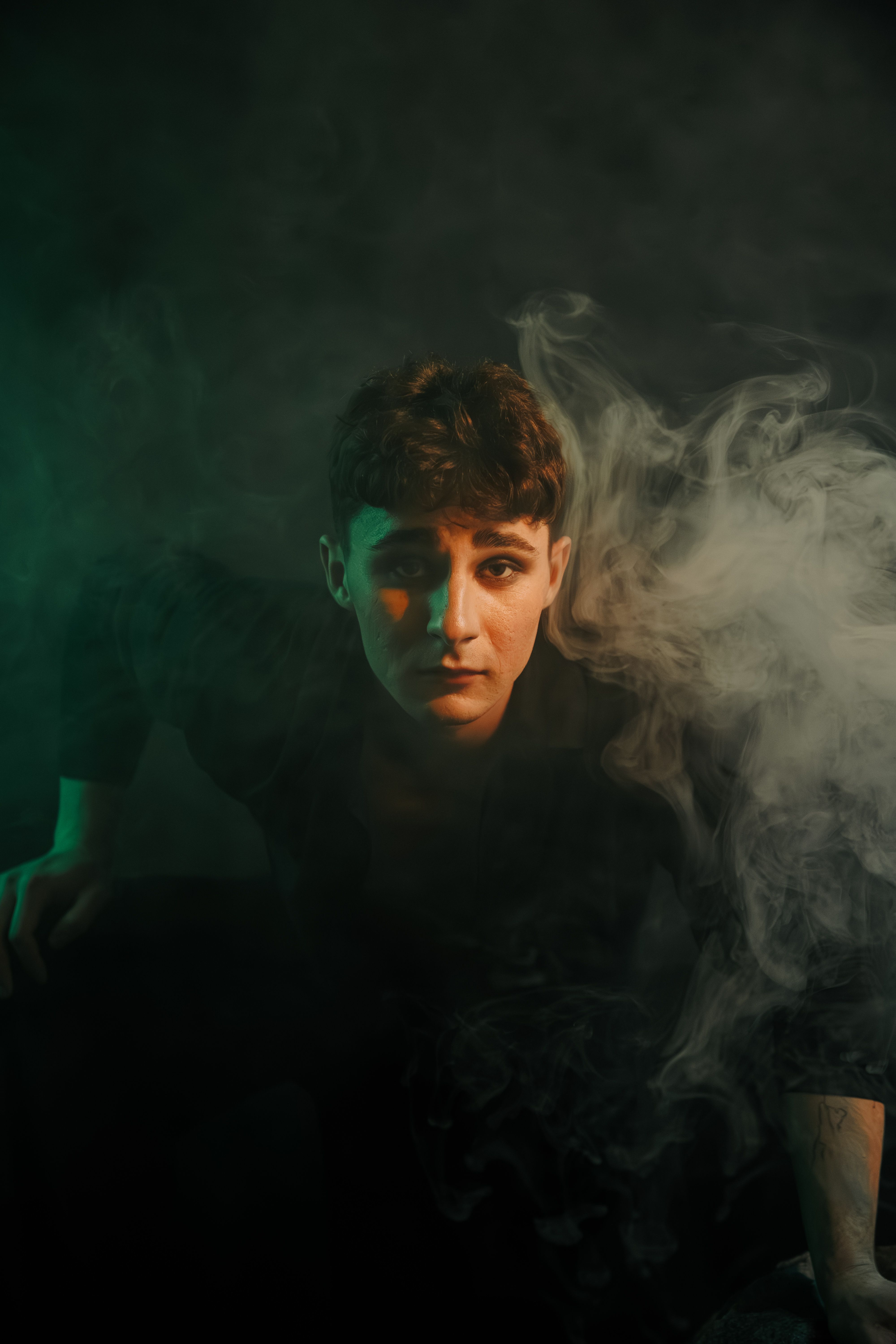
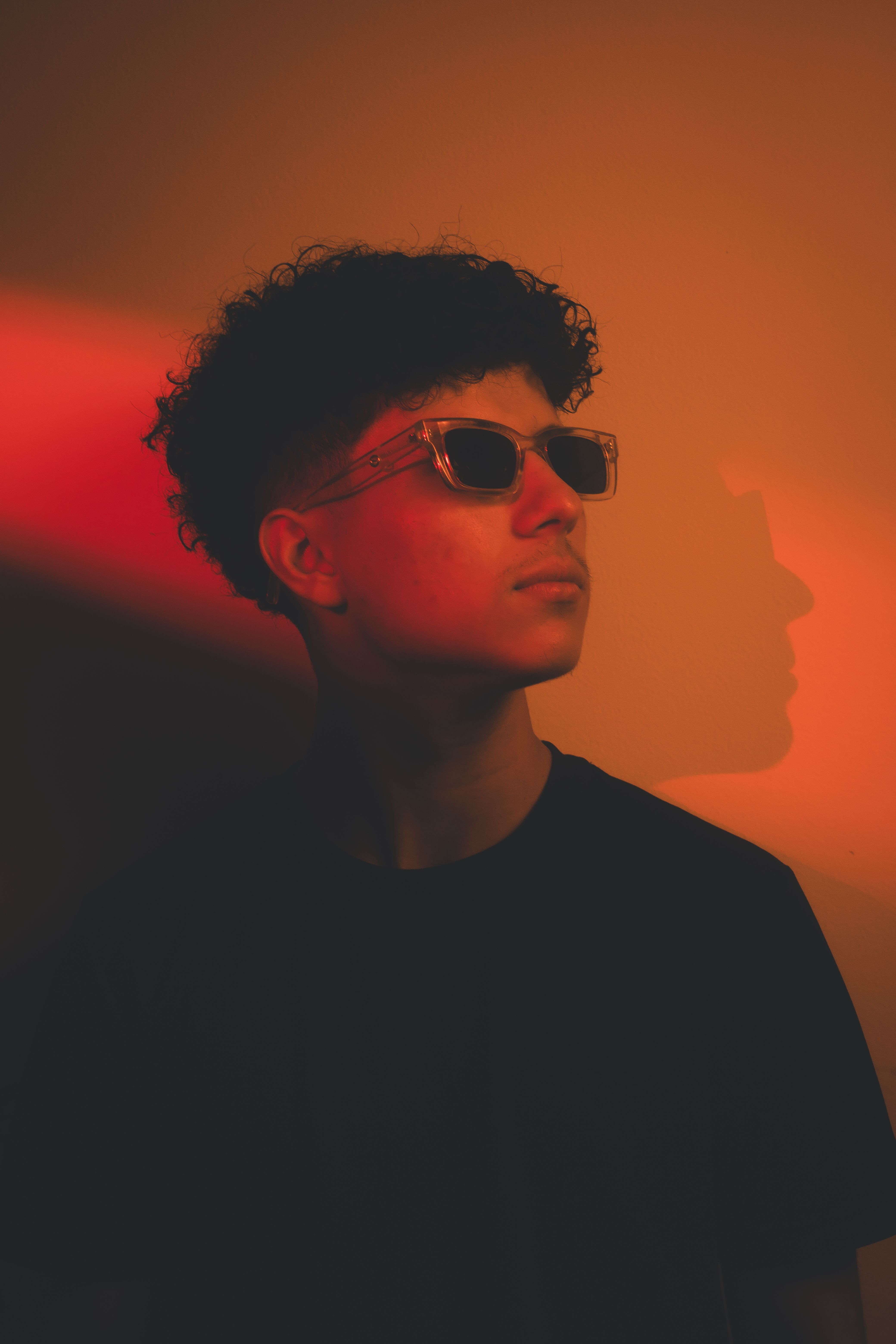
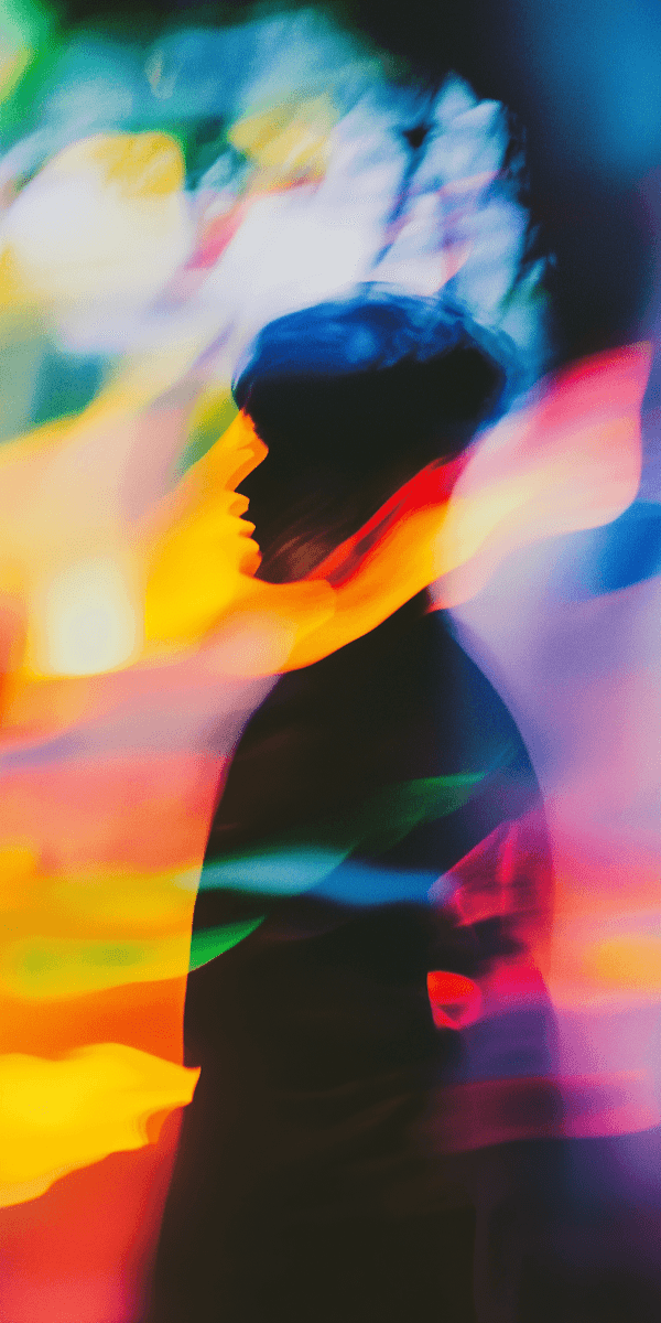
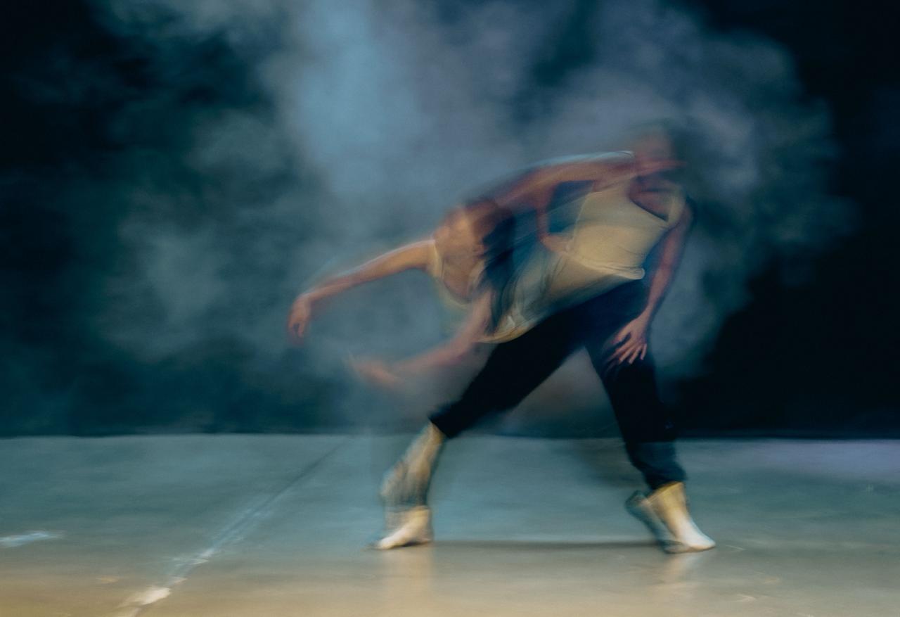
We established an art direction built around contrast: polished and imperfect, intimate and expansive, still and moving. Photography, typography, cropping, colour, and composition were treated as editorial tools rather than fixed decoration. This allowed each feature to feel specific without becoming visually disconnected.
A set of underlying principles created continuity across all formats. Generous negative space, tactile image treatment, expressive scale shifts, and quiet typographic restraint give the journal its recognisable rhythm. The system provides contributors with a clear creative brief while leaving enough room for surprise, interpretation, and experimentation.
03 - OUTCOME
An editorial world with depth
Still / Moving now has a visual identity that feels distinctive, considered, and adaptable. Each feature can shift in tone without losing the publication’s centre of gravity, giving readers a more layered and memorable experience across every issue.
The art direction has also created a stronger relationship between editorial and audience. Stories feel collectible rather than disposable, and the journal’s visual language has become part of its cultural point of view. It is a system that supports both consistency and evolution over time.